WisBar Advance Skinning Guide
Note: This document is designed to help you create your own skins by hand
WisBar Advance 2.x Skinning Topics:
|
Introduction
Creating a new skin for WisBar Advance is simple, once you've chosen the
graphics that you wish to use. WisBar Advance's (WA for short) skin file
is a simple INI file with a .skin extension. Each file must contain a
section indicating the name of the skin and whether or not it contains high-resolution
images for WM2003SE VGA devices. Optionally, this header can also contain
the author's name and his/her email address.
Here is a sample skin file heading:
[Skin Info]
Author=Lakeridge Software
AuthorEMail=skins@lakeridgesoftware.com
Name=WisBar Demo Skin
HiRes=False
Notes=Copyright 2004 Lakeridge Software
# Copyright 2004 Lakeridge Software
PleaseWait=<path to image>
If you look carefully, you will see several items. First, the items in
the skin file are separated by the "=" symbol. Also, if you
look at the "HiRes" field, you will see that it is set to "False".
This indicates that the skin has graphics files appropriate for QVGA (240x320)
resolutions. If you specify "True", then WisBar Advance will scale
the graphics as appropriate. The "Notes" value allows you to add additional
notes to be displayed on the theme settings page. You can have a maximum of 249 characters
here. Finally, the last line preceded by a "#"
symbol is a comment. Comments must always begin with the "#" symbol
and can be placed anywhere in the file.
One thing to note is that all of the paths to the images and sounds are relative to
the location of the skin file. That means that you should NOT use absolute paths. So,
for example, if your skin file resides in "\Program Files\Lakeridge\WisBar
Advance\Themes\My Theme", then that path will be prepended to any path specified in
your skin file. So, "image.bmp" will be translated as "\Program
Files\Lakeridge\WisBar Advance\Themes\My Theme\image.bmp".
[b]A new feature with version 2.5[/b] is the "PleaseWait" entry. This specifies an image
that will be displayed while WisBar loads and updates the current theme.
If no image is specified, WisBar will use the default image.
|
Taskbar
The taskbar is the heart and soul of WA. From this window, most of the functionality
is accessed. The management of tasks and several system controls are available here.
Also, this bar is visible from nearly every application on your PocketPC, therefore it is
essential that it appeals to you visually.
As an example, here is a screenshot from WA's default theme with several of the buttons
described:
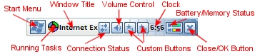
We will address each of these items in this section.
Background
Backgrounds in WA have several modes:
- Scaled
- Tiled
- Solid Color
- Gradient
You can also specify a portrait and a landscape image.
The only mode that probably needs explanation is the gradient mode. In this
mode, you can specify to use either custom left and right colors, or you can
tell it to use the colors assigned to the current today theme (PPC2002 and later
only).
Let's see how the taskbar's background skin works:
[Topbar]
Portrait=title_portrait.png
Landscape=title_landscape.png
Mode=Scaled
Left Color=0
Right Color=0xffffff
Solid Color=0xff0000
Use Theme Colors=False
Left Margin=5
Right Margin=5
The first two values specify the image to be used when in portrait mode and in
landscape mode. WA2 can detect the different orientations of the screen, so you
can specify a special version for landscape. The portrait option is required (as
older devices run in this mode 90% of the time). If the landscape setting is not
set, then the portrait image will be used instead.
The next setting is "Mode". This can accept the following values:
Scaled, Tiled, Color (for a solid color) and
Gradient. The next four options are only used if Color or Gradient are
specified.
If you choose to use the gradient option, then you can either specify the
colors manually, or you can use whatever the current today theme's colors are
set to. This is set by the "Use Theme Colors" option. If you choose to
set the colors manually, then WA will read the colors set by "Left Color" and
"Right Color".
Colors in WA themes are represented in reverse hexadecimal form. In other words,
the colors need to look like this: 0xbbggrr (where r=red, g = green and b=blue). Each
value needs to be within the range of 0 to ff (0 to 255). You can use the Windows
Calculator on your desktop to help you convert these numbers.
So, for example, if you wanted to specify solid blue as your color (represented by
RGB values red=0, green=0, blue=255), you would enter 0xff0000 as your value. If you
wanted to specify black, you could just put 0 (WA would interpret that as 0 intensity for
each color component) while if you wanted to specify white, you would enter #ffffff.
So, getting back to our skin, we can see that in the above example, the background's
gradient colors are set to black on the left and white on the right, giving kind of a
grayscale effect.
If we had specified "Color" as our background mode, the "Solid Color"
option would be read and the bar would have a blue background (0xff0000).
The last two options, "Left Margin" and "Right Margin" are unique to
the taskbar. Normally, the buttons begin at the far left and far right sides of the screen.
These options allow you to specify how far from the edges to begin placing the buttons (in
pixels).
Buttons
Buttons on the taskbar consist of two images: a normal state and a pressed state. It is
important to make sure that the two images are the same dimensions. These buttons also
support transparency. The "transparent" color (or the color that won't be visible),
is selected from the bottom-left pixel of the button image. So, for example, if you place
a color of RGB(255, 0, 255) in the bottom-left pixel, anywhere that color appears in the
button image, the background will show through instead.
Here is what the skin file entry looks like for the buttons:
[Button Images]
Start Menu Normal=start_normal.png
Start Menu Pressed=start_pressed.png
Close Normal=close_normal.png
Close Pressed=close_pressed.png
OK Normal=ok_normal.png
OK Pressed=ok_pressed.png
Notify Normal=notify_normal.png
Notify Pressed=notify_pressed.png
Volume Normal=volume_normal.png
Volume Pressed=volume_pressed.png
Mute Normal=mute_normal.png
Mute Pressed=mute_pressed.png
Battery/Memory Normal=battery_normal.png
Battery/Memory Pressed=battery_pressed.png
Home Normal=home_normal.png
Home Pressed=home_pressed.png
Menu Normal=menu_normal.png
Menu Pressed=menu_pressed.png
Custom1 Normal=custom1_normal.png
Custom1 Pressed=custom1_pressed.png
Custom2 Normal=custom2_normal.png
Custom2 Pressed=custom2_pressed.png
Connection Normal=connect_normal.png
Connection Pressed=connect_pressed.png
Disconnect Normal=disconnect_normal.png
Disconnect Pressed=disconnect_pressed.png
Signal Strength Normal=signal_normal.png
Signal Strength Pressed=signal_pressed.png
SIP Normal=
SIP Pressed=
Battery/Memory Custom=FALSE
Signal Strength Custom=TRUE
There are a couple of values in the above section that we
need to look at. First are the SIP values. The SIP button
is the button that will bring up the virtual keyboard,
Transcriber, etc. This button is only visible if the taskbar
gets moved to the bottom of the screen by an application,
which is rare these days. In the example above, we didn't
specify any images for the button. In this situation, this is
okay because WisBar Advance will provide an image, just in case.
This is not the case with the other buttons.
The other thing that needs to be noted is the battery/memory
button. This is a special case button as WA will draw additional
information on it. If you color the graphic correctly, WA will
use the button as a live meter for both the battery power and
the free RAM available.
In order to allow WA to draw the meter, you need to specify certain
colors in the image. The following color table explains what colors
need to be used in order to achieve this effect:
Battery Level Colors
The following colors are used to represent the current state of the battery:
10% - rgb(255,240,255)
20% - rgb(255,241,255)
30% - rgb(255,242,255)
40% - rgb(255,243,255)
50% - rgb(255,244,255)
60% - rgb(255,245,255)
70% - rgb(255,246,255)
80% - rgb(255,247,255)
90% - rgb(255,248,255)
100% - rgb(255,249,255)
Memory Level Colors
The following colors are used to represent the current state of main memory:
10% - rgb(255,255,240)
20% - rgb(255,255,241)
30% - rgb(255,255,242)
40% - rgb(255,255,243)
50% - rgb(255,255,244)
60% - rgb(255,255,245)
70% - rgb(255,255,246)
80% - rgb(255,255,247)
90% - rgb(255,255,248)
100% - rgb(255,255,249)
By default, WA will fill in green for the available battery power, gold
for available memory and red for the unavailable values of both. However,
if you noticed in the example above, there was a value titled
"Battery/Memory Custom". If this value is set to TRUE, then
WA will pick up the colors from two right-most columns in your images.
In this situation, you want to increase the width of your image by two pixels.
WA will pick the colors from these columns as follows:
The colors in the far-right column will be selected for the battery. The bottom
pixel will be used as the unavailable color (it will be used to display the
used portions of the battery). The next pixel above that represents the battery at
10%. The next above that represents the battery at 20% and so on until you reach 100%.
The memory colors are picked from the next column to the left and follows the same
pattern.
The signal strength meter, like the battery/memory meter, also displays various states.
When the "Signal Strength Custom" is set to TRUE, then the colors representing
the bars are picked up from the right-most column of the image. WA will pick the colors from
this column as follows:
The bottom pixel will be used for unavailable bars. The next pixel up will used for one
bar, the next up for two bars and so on until you reach five bars.
Signal Strength Level Colors
The following colors are used to represent the current signal strength:
1 bar - rgb(241,255,255)
2 bars - rgb(242,255,255)
3 bars - rgb(243,255,255)
4 bars - rgb(244,255,255)
5 bars - rgb(245,255,255)
Fonts
There are three text elements in the taskbar that require font settings: the current
window title, the standard clock and the small clock. Fonts can be any size, any
color and can use shadows of any color. The font entries for these three items appears
as below:
[Clock Font]
Name=Frutiger Linotype
Color=0
Size=7
Shadow=0
Style=Bold
[Title Font]
Name=Frutiger Linotype
Color=0
Size=7
Shadow=0
Style=Bold
[Small Clock Font]
Name=Frutiger Linotype
Color=0
Size=6
Shadow=0
Style=Bold
If you notice, these three sections take the same values. The "Color" and
"Shadow" values take color values as described in the taskbar background
section above. In the case of all three fonts above, both the shadow and the text are
being rendered in black. The "Style" field can take several values, each
separated by a comma. These values are "Bold", "Italic",
"Underline", "Strikeout" and "Shadow".
|
Volume Dialog
The volume dialog is an optional element to skin. If you choose not to skin it,
WA will render the dialog as a bubble, similar to the builtin volume bubble on
your device.
If you choose to skin the volume dialog, place the following entry in the skin
file:
[Volume Bubble]
Image=volume_bubble.png
Unlike the other images, the volume bubble is limited to a specific size. On
QVGA devices (240x320), the image needs to be limited to 75x185. On VGA devices,
the image needs to be limited to 150x370. Of course, if you're designing a QVGA
theme, then the image will be stretched appropriately on VGA devices.
The image uses RGB(255, 0, 255) as its transparent color. So, anywhere you specify
this color, whatever is underneath it will show through. Also, at coordinates
(13,43), a slider of dimensions 22x84 will be placed. And at coordinates (14,135)
and (14, 152), two radio buttons of dimensions 35x17 will be created (double all of these
values for VGA devices). These items are the volume controls and cannot be moved.
|
Today Screen Menubar
The Today Menubar is the menubar that is visible on the Today screen. It consists
of the "New" button and the system tray. Skinning it is similar to skinning
the taskbar as all of the background values remain the same. Here is what the skin
file entry looks like:
[Today Menubar]
Portrait=today_portrait.png
Landscape=today_landscape.png
Display New Text=FALSE
Name=Tahoma
Color=0
Size=8
Shadow=0
Style=Bold
Mode=Scaled
Left Color=0
Right Color=0
Solid Color=0
Use Theme Colors=FALSE
In the example above you will notice that the background items are similar to the
taskbar's background items. In addition to the background settings, this also contains
font settings, similar to those described in the taskbar section. There is a new
value in this section, however. That is the "Display New Text" value. If this
value is set to TRUE, WA will render the text for the "New" button. However,
if this value is set to FALSE, then the text will not be rendered, allowing you to place a
custom graphic in its place.
|
Application Menubar
A new feature of WA2 is the ability to skin the menubars of other applications. This
allows you to create a unique look for your entire device, rather than just your today
screen. Below is an example of the skin file entry:
[Menubar]
Portrait=menubar.png
Landscape=menubar.png
Normal=normal_menu.png
Pressed=pressed_menu.png
Disabled=disabled_menu.png
Name=Frutiger Linotype
Color=0
Size=7
Shadow=0
Style=Bold
Mode=Scaled
Left Color=0
Right Color=0
Solid Color=0
Use Theme Colors=FALSE
As with the Today Menubar above, the application menubar combines both the font and the
background settings into one entry. However, there are several entries in this section
that are unique to the application menubar. These are "Normal", "Pressed"
and "Disabled". These values provide images for the different states of
the individual buttons on the menubar. As with the taskbar buttons, it is important that
these images have the same dimensions.
WA does not simply draw these images as you have drawn them. The reason for this is that
buttons on the menubar are not always the same size. So, WA will do some partial stretching
in order for the buttons to look correct. This is how it works: first, the image is
stretched vertically to accommodate the height of the button. Then, the left three
pixel columns of the image are not stretched horizontally, allowing for properly rounded
corners. The right three pixel columns are also not stretched horizontally. However, the
remainder of the image is stretched horizontally to fill in the remaining section of the image.
Then, the text or icon is rendered on top of the button image. If you remember to keep
any rounded corners to three pixels wide the button should look correct when rendered.
|
SoftKeys
SoftKeys are specific to Windows Mobile 5 devices. In many programs, these replace the
standard application menu buttons with two large buttons from which all menu functions
are accessible.
When a skin doesn't include a section for the softkeys, the images will be taken from
the application menubar section. Thus, even older skins will work properly on WM5 devices.
To skin the softkeys, you will need the following section:
[SoftKey]
Portrait=softkey.png
Landscape=softkey.png
Mode=Scaled
Left Color=0
Right Color=0
Solid Color=0
Use Theme Colors=FALSE
Left Button=softkey_btn.png
Right Button=softkey_btn.png
Left Pressed=softkey_left_pressed.png
Right Pressed=softkey_right_pressed.png
Left Disabled=softkey_btn.png
Right Disabled=softkey_btn.png
Most of the options above are identical to the application menubar options. You
may notice, however, that there are no font settings. Current versions of WisBar Advance
currently use the application menubar font for the softkeys font. This may change in
future versions, however.
One more thing to note, for best results, the buttons images should be 90 pixels by
26 pixels (180x52 for VGA devices).
|
Application Buttons
Another new feature in WA2 is the ability to skin push buttons in other applications.
I personally like this feature as it allows you to replace the boring gray rectangles
with something more pleasing to the eye. As we have done above, here is the skin file
entry necessary to change the appearance of the buttons:
[Buttons]
Name=Frutiger Linotype
Color=0
Size=7
Shadow=0
Style=Bold
Pressed Color=0xffffff
Normal=button_normal.png
Pressed=button_pressed.png
Disabled=button_disabled.png
Focused=button_focused.png
Left=3
Top=3
Right=3
Bottom=3
checkbox=checkbox.png
radiobutton=radiobutton.png
This section contains the standard font entry, as described in the taskbar fonts section
above. In addition, this contains a "Pressed Color" entry. This allows you to
specify a different color for the font when the button is pressed. In the example above,
we are using white (0xffffff).
There are also entries for the different states of the button: "Normal",
"Pressed", "Disabled" and "Focused". These are pretty
self-explanatory. However, just as a note, the focused state occurs when keyboard input
will be sent to that specific button. As such, we tend to render this button slightly
differently than the other buttons, thus notifying the user of the situation.
Because buttons appear as different sizes in different applications, some stretching
must occur. However, the method used to stretch the buttons is different than how the
application menubar buttons are stretched. If you notice, there are four values in the
example above: "Left", "Top", "Right" and "Bottom".
These values are the margins describing what sections will not be stretched. Here's an
example of how the margins work:
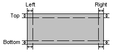
As you can see in the image above, the image is broken into a 3x3 grid. The width of the
grid items are defined by the values mentioned above. So, using our example, the margins
are each three pixels. That means that the top three pixels and bottom three pixels
are not stretched vertically and that the left three and right three pixels are not
stretched horizontally. Using that logic, the corners are each 3 pixels by 3 pixels and
are not stretched at all. Using these values, you can create rounded corners, jagged edges,
etc. and have them look correctly when stretched.
New in version 2.0.1.7, WA2 allows for the skinning of checkboxes and radiobuttons. Each
control is represented by a single graphic as defined by the checkbox and radiobutton values,
respectively. Checkboxes consist of six equal size glyphs. The first glyph is the
unchecked state followed by the disabled unchecked state. Next is the checked state followed
by a disabled unchecked state. Last is the indeterminate state (for 3-way checkboxes)
followed by its disabled state. Radio buttons follow the same format, but instead of six
glyphs, the image contains four equal size glyphs. The indeterminate state is not
available for the radiobuttons.
|
Cascading Start Menu
The cascading start menu has only a few elements that can be skinned. If you choose
not to include this section, WA will use some default graphics instead. Here's what
the skin entry looks like:
[Start Menu Skin]
Program Group=group.png
Start Menu Picture=
Start Menu Picture 2=start_sublevel.png
Name=Frutiger Linotype
Color=0
Size=7
Shadow=0
Style=Bold
As with most of the elements described above, the start menu section contains font
settings, allowing you to customize the appearance of the text.
New in WA2 is the
ability to control the background(s) of the start menu. The values that do this are
"Start Menu Picture" and "Start Menu Picture 2". If values are
not provided for these, then the start menu image provided by the current Today theme
is used. The second start menu picture is used for all menus below the first menu,
thus providing a little variety in the appearance of the menu.
The other item that can be skinned the Program Group icon. This is the icon that
appears next to each of the subfolders in the cascading menu. The value, "Program
Group", allows you to set this image. This image does allow transparency using
the color RGB(255, 0, 255). The dimensions of this image should be set to 16x16 on QVGA
devices and 32x32 on VGA devices. As with all other graphics, should you choose a QVGA
image, it will be stretched appropriately on VGA devices.
|
Sounds
While not a visual element, WA2 now provides the ability to change the system event sounds.
This functionality exists in the PPC2000 OS, but for some reason Microsoft removed this
feature. Now, with WA2, you can customize them again. Currently, this section (and the
button skinning) are only available through your skin files. Here is what the skin file
entry looks like:
[Sounds]
SystemAsterisk=Sounds\astersks.wav
MenuCommand=Sounds\menusels.wav
MenuPopup=Sounds\menupops.wav
Minimize=Sounds\windmins.wav
Startup=Sounds\startups.wav
SystemDefault=Sounds\defaults.wav
SystemExclamation=Sounds�xlams.wav
SystemHand=Sounds\defaults.wav
SystemQuestion=Sounds\questns.wav
Open=Sounds\openprgs.wav
Close=Sounds\closes.wav
Maximize=Sounds\windmaxs.wav
The labels above correspond to the aliases used by the shell to represent certain shell
events. So, for example, the "Open" sound is used when a new window
has been created and the "Close" sound is used when a window is closed. If you
do not specify a sound, the default sound (if there is one) will be played instead. One
thing to remember is that WA does not actually generate these events, so they may not
always play when you would expect them to.
These sounds can't be just any type of sound file. They must be WAV files in the PCM
format as this is what the OS supports. If you have a sound file and you're not sure what
format it is in, then on your desktop launch "Sound Recorder" (provided with
all versions of Windows) and load up the sound file. Using this program you can convert
the file to PCM format, adjust the volume and add special effects to the sound.
|
Colors
WisBar Advance also gives you the ability to set the system colors in your theme.
Once these colors have been applied, the user will be prompted to soft-reset his/her
system in order for them to take effect. The entry in the skin file looks like this:
[Colors]
Active Caption =
Inactive Caption =
Menu =
Window =
WindowFrame =
Menu Text =
Window Text =
Caption Text =
Highlight =
Highlight Text =
Button Face =
Button Shadow =
Gray Text =
Button Text =
Inactivate Caption Text =
Button Highlight =
Tooltip Text =
Tooltip Background =
Static =
Static Text =
This section is optional. If you do not specify this section, then your colors will revert
to the system's default colors.
Each entry takes a value in bbggrr format (as discussed above). So, for example, if you wanted
a solid blue color for your Static Text, you would make sure that the following line appears in
your Colors section:
Static Text = 0xff0000
Just follow this format for each of the values in the section.
|
Task Panel
Perhaps the most difficult feature of WisBar Advance to skin is the task panel. This is the panel
that appears when you tap on the menu button. As a quick overview, here is the skin section:
[Task Panel]
Use Bubble=no
Name=Tahoma
Size=8
Style=Bold
Color=0x84582f
Shadow=0
Title Color=0
Selected Color=0xffffff
Top Bar=topbar.png
Bottom Bar=bottombar.png
Item=taskitem.png
Selected=taskselect.png
Top Left=5
Top Right=33
Title Top=-1
Title Bottom=-1
Bottom Left=1
Bottom Right=1
Item Left=1
Item Right=1
Select Left=3
Select Right=3
Title Align=0
Show Separators=no
Separator Color=0
Sidebar=sidebar.png
Image Count=8
Buttons=buttons.png
The first option you'll see in this section is the "Use Bubble" option. When set to yes,
the task panel will be rendered using a bubble similar to the other builtin taskbar notifications. If set to
no, the images will be used. Note: if one of the images is missing or cannot be loaded, the task panel
will revert to using the bubble mode.
The task panel uses a single font for all of the text displayed. As such, the font settings are identical to
those found in other sections already mentioned. However, there are two values specific to the task panel:
"Title Color" and "Selected Color". The title color specifies what color the font will use
at the top of the panel while the selected color will determine the color of the individual items when they are
highlighted (or selected).
The images, "Top Bar", "Bottom Bar", "Item" and "Selected" refer to the
top and bottom of the panel, the background for each item and the selected image for when an item is selected. If
one of these files cannot be loaded, the panel will revert back to bubble mode.
Each button has corresponding stretch margins (as detailed in various sections above). These values are indicated by
the "Left" and "Right" values.
The top image also uses the "Title Top" and "Title Bottom" values. These are not stretch margins.
What they indicate is how many pixels from the top and the bottom the title text will appear. Leaving these values at -1
will cause WisBar to center the text in the title area.
The title area also uses "Title Align". This value aligns the text horizontally in the title area. The following
are valid values:
0=Align the text to the left
1=Center the text
2=Align the text to the right
Included in this section are three values that are specific to bubble mode: "Show Separators", "Separator
Color" and "Sidebar". These have no effect in skinned mode. The sidebar value allows you to specifiy the
image that will appear underneath the application icons on the left side of the bubble.
"Image Count" and "Buttons" apply to both modes. The image specified by "Buttons" defines the
images that are interspersed with the application icons. In older versions of WisBar, this image consisted of seven images. However,
the latest release of WisBar Advance supports eight images. So, the "Image Count" value was added to indicate how
many images the "Buttons" image contains. If this value is omitted, the image count will be defaulted to seven.
The layout for the buttons image should look something like this:

Each button must be the exact same width and must be in the following order:
Desktop
Close App (the icon to the right of each application)
Minimize
Close Background
Close All
Settings
Exit
Close (this is the image that was missing in older versions)
|
Custom Notifications
Skinning the individual system notifications is something that is new in version 2.5. WisBar now
has the ability to place an icon in the taskbar that represents a specific notification. For example,
the builtin Inbox/Messaging application typically displays an envelope when there is new email to
view. WisBar can now display any icon on the taskbar, instead of using the standard icon.
Customizing a notification in the taskbar requires two sections:
[Custom Notifications]
0 = <Notification 1>
1 = <Notification 2>
...
[Notify.<Notification 1>]
Normal = <Path to image>
Pressed = <Path to image>
[Notify.<Notification 2>]
Normal = <Path to image>
Pressed = <Path to image>
There are a couple of things to note:
First, the numbers in the [Custom Notification] section [b]does[/b] matter. The numbers need to start
at zero and increase sequentially (i.e. 0, 1, 2, 3, ...). The notifications assigned to the numbers do
not matter. However, WisBar reads this section using the numbers until it finds a break in the
sequence.
<Notification 1> and <Notification 2> in the sections above need to be replaced to the
"title" of the notification. The image below displays where you can find the title:
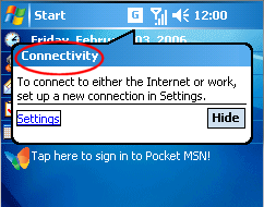
Using the above image as an example, the custom notification sections would look like this:
[Custom Notifications]
0 = Connectivity
[Notify.Connectivity]
Normal = <Path to image>
Pressed= <Path to image>
Of course, the <Path to image> should be replaced with a path to the
appropriate graphic.
|
| |
|